ibaDaVIS offers different tile types for visualizing data and value series.
Line chart
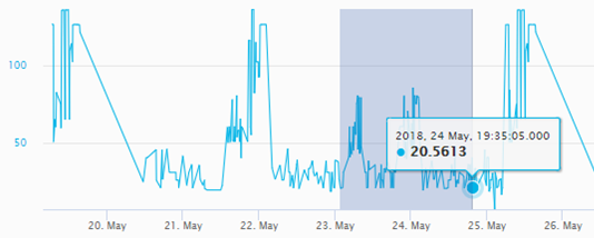
In the line chart, the signals or characteristic values are displayed as a trend over time.
Use the Line chart tile type for the following use cases:
-
Detection of parameter trends
-
Visualization of interruption times
-
Visual detection of abnormal trend developments
For information on the setting options for line charts, see Tile type Line chart.
Other useful functions
-
Zoom function used as interactive filter for all tiles on the dashboard
-
Y-axis manually scalable
Scatter chart
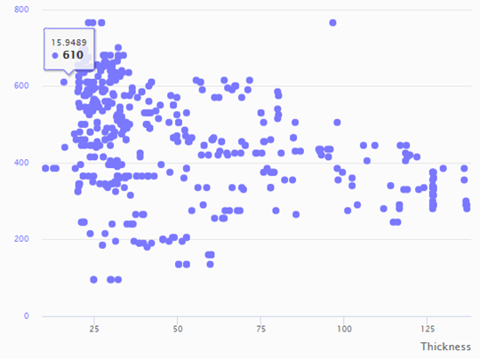
You can use a Scatter chart to display the relationship between two signals or value series by controlling the X and Y position of the points of 2 signals. A signal is selected as the x-axis here and one or more other signals can be set in relation to this.
Use the Scatter chart tile type for the following use cases:
-
Visualization of correlations
-
Monitoring of process deviations
-
Visual detection of outliers
For information on the setting options for scatter charts, see Tile type Scatter chart.
Other useful functions
-
Switching the X-axis from time to one of the selected value columns
-
Viewing the relationship e.g. between speed and momentum
-
X- and Y-axis manually scalable
Histogram
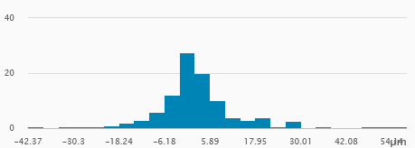
The Histogram is suitable for showing the frequency distribution of a characteristic value.
Use the Histogram tile type for the following use cases:
-
Visual detection of process deviations
-
Visualization of process stability
For information on the setting options for histograms, see Tile type Histogram.
Other useful functions
-
Switching between total and percentage aggregation
-
Displayed value range configurable
Pie chart
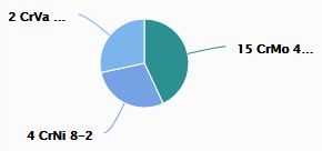
A Pie chart is suitable for showing the distribution of a whole into parts (segments) corresponding to the frequency of a category or characteristic.
Use the pie chart tile type for the following use cases:
-
Display of the distribution of data through non-numerical values, i.e. values represented by a text.
-
Examples: Number of products per material class, production output per customer, etc.
For information on the setting options for pie charts, see Tile type Pie chart.
Other useful functions
-
Tapping on a segment applies the filter for the selected category to all tiles in the dashboard.
-
The selected category is summarized by sum, number, average, maximum or minimum.
Gauge
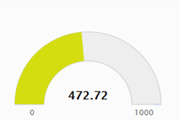
You can use the Gauge to display individual values, e.g. an average license time limit, the total number of products or other characteristic values. The selected value column is aggregated using the sum, count, average, max or min operator. The last value determined is displayed.
For information on the setting options for gauges, see Tile type Gauge.
Table
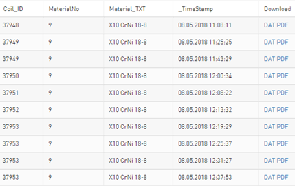
Selected columns from the data table are shown in the Table.
For information on the setting options for tables, see Tile type Table.
Other useful functions
-
Sorting the displayed values by tapping on the table header
-
Tapping the table header opens a column-based filter that is applied to all tiles in the dashboard.
-
Download DAT files and PDF reports
Bullet Graph
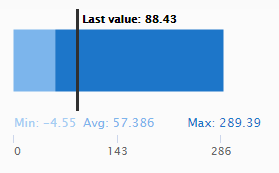
With the Bullet Graph, several statistical characteristic values of a value series can be displayed.
Max, min and average values as well as the last determined value of a selected value series are displayed in a horizontal bar.
For information on the setting options for bullet graphs, see Tile type Bullet graph.
Bar chart
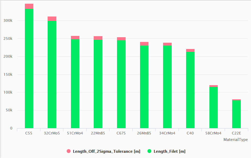
Characteristic values from a database can be displayed in bars and grouped in selected time periods and categories in the Bar chart. You can display the data side by side or as a stacked diagram.
For information on the setting options for bar charts, see Tile type Bar chart.
Value display
The Value display tile type makes it possible to visualize several individual values on a tile as cells or in grid format on the dashboard.
For information on the setting options for value displays, see Tile type Value display.
Heatmap
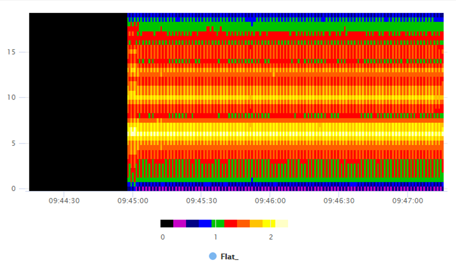
Signals from DAT files that are combined as a vector group can be visualized as a Heatmap.
For information on the setting options for heatmaps, see Tile type Heatmap.
Radar chart
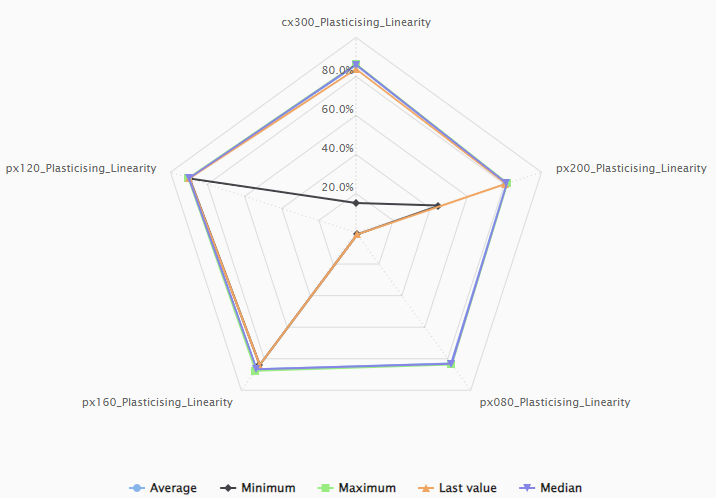
You can use the Radar chart tile type to display data from database tables, ibaHD-Servers or DAT files. Use the radar chart, for example, to visualize statistical data such as maximum, minimum and average values of several selected columns or signals.
For information on the setting options for radar charts, see Tile type Radar chart.
