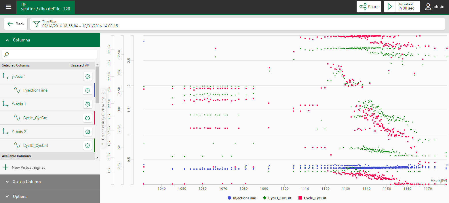
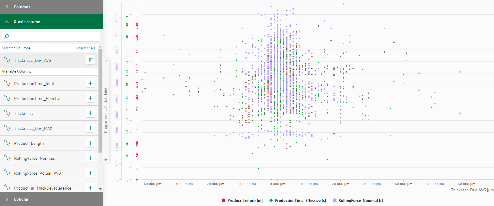
You can use a Scatter chart to display the relationship between two signals or value series by controlling the X and Y position of the points of two signals. A signal is selected as the x-axis here and one or more other signals can be set in relation to this.
Columns
In the Columns section, select the signals that are to be shown in the scatter chart. The signals are shown in the chart first as points in relation to the time axis.
Use the ![]() button to define the value range for each axis and signal individually, see also
Axis scaling and signal assignment.
button to define the value range for each axis and signal individually, see also
Axis scaling and signal assignment.
When you move the cursor over the points, a tool tip appears specifying the X and Y value at the cursor position.
X-axis Column
In the X-axis Column section, you can define a selected signal as X-axis.
Options
Ordered by sequence
The value trend is ordered in ascending order by time. The x-position of the result values in the trend corresponds to the sequential number in the query result. This function is only supported if no value is selected as the X-axis.
Display legend
Displays the names of the selected columns as a legend
Show Lines
Connects the displayed points in chronological order.

