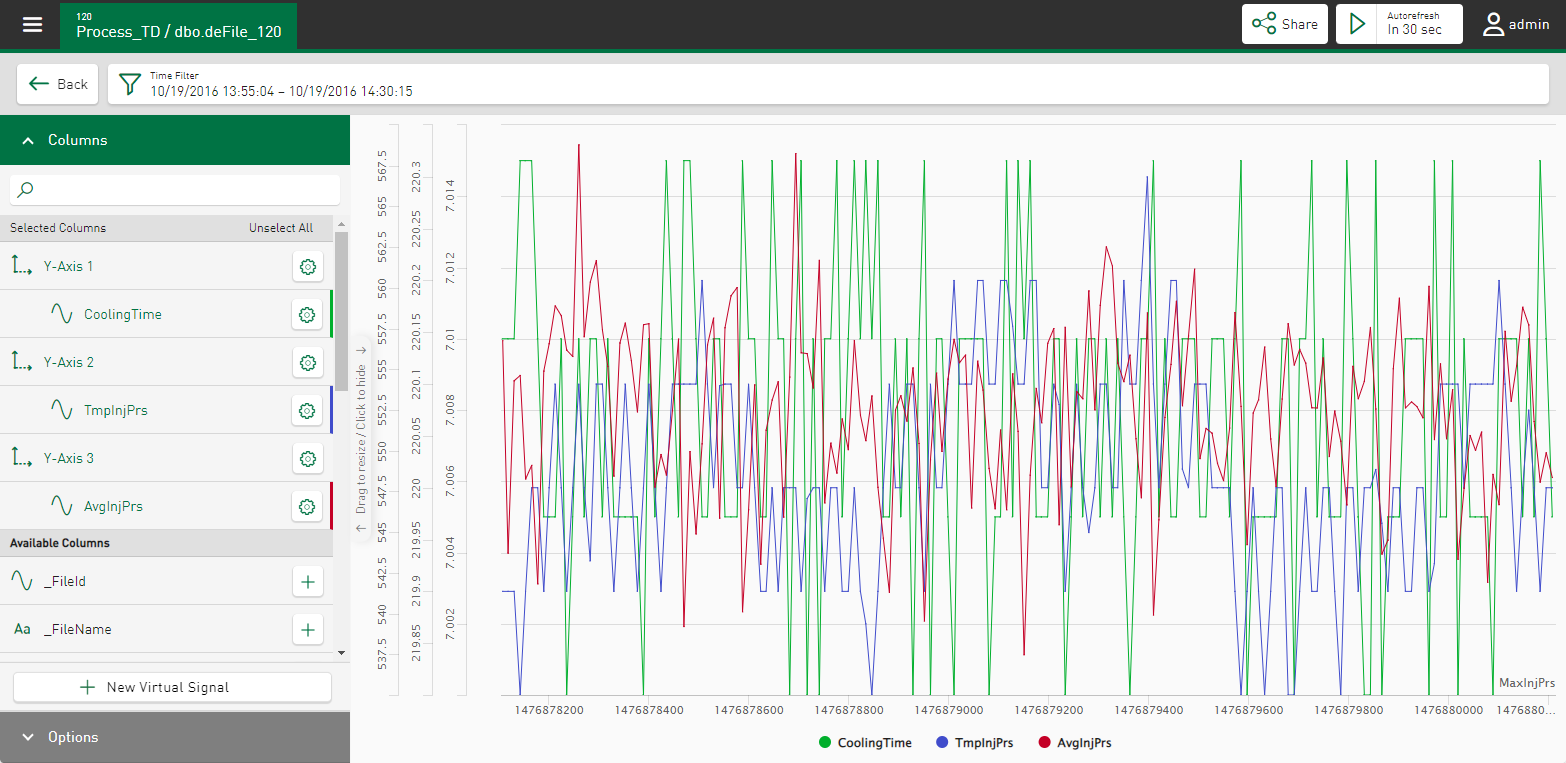
In the line chart, the signals or characteristic values are displayed as a trend over time. This makes it possible, for example, to identify parameter trends or interruption times.
Columns
Select the signals for the display by tapping on the names under Available Columns. Selected signals are directly assigned to an axis and displayed in the trend display.
Use the button ![]() to define the axis and signal settings in a property window, see Axis scaling and signal assignment.
to define the axis and signal settings in a property window, see Axis scaling and signal assignment.
When you move the cursor over a trend, a tool tip appears specifying the time and measured values at the cursor position.
Options
Appended view – recorded time
Data files are displayed synchronously with the recording time according to their real position on the time-based X-axis.
The signals are displayed according to the file start time and measurement signal duration; the start of a new file is visualized by interrupting the measurement signal curve.
Vertical separators are shown at the file end when visualizing length-based signals.
Tip |
|
|---|---|
|
This display is suitable for visualizing the signal progression over time in the measurement signals or, in the case of length-based signals, for the length-based display of the measurement signals per unit length. |
|
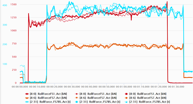
Appended view – relative time
Data files are displayed one after the other in chronological order and on the relative time axis.
Stacked view
Display of the same measurement signals from different measurement files
The measurement signals are all synchronized to the same starting time 0:00:00 and are displayed. The displayed time range is derived from the respective longest data file.
Tip |
|
|---|---|
|
This display is suitable for the direct comparison of the same measurement signals from different files, or of sequences that are to run synchronously in all selected data files. |
|
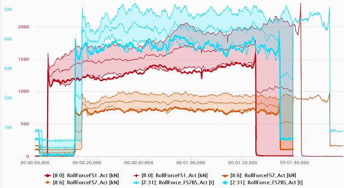
Envelope view
Display of the envelope curve from the same analog measurement signals from different data files
The measurement signals are synchronized to the same starting time 0:00:00, as in the stacked view. In addition to the maximum and minimum, the calculated average is shown.
Tip |
|
|---|---|
|
The display is suitable for comparing many measurement signals from different data files, the display is reduced to a flat representation. The maximum, minimum and average values can be read directly. Deviations in repetitive process sequences become immediately apparent. |
|
Display event filter
You can select configured events using a filter function as start or stop events from DAT files, see Using the DAT file event filter.
Signals from the last file separately
See Highlighting signals from DAT files.
Display legend
The currently selected signal names appear not only in the tile's trend view, but also in the dashboard view.
Hide repeated text marks
Duplicate text marks are no longer displayed.
Fill gaps
Signal data from segment tables can be visualized if they were extracted based on the DB functionality of ibaAnalyzer. In this case, "ZERO" values in the data evaluation lead to gaps between the measuring points in the trend display. Enable this option if you want to connect the measuring points with a line to close the gaps.
Display reference signals
See Visualizing reference signals.
Ordered by sequence
The value trend is ordered in ascending order by time. The x-position of the result values in the trend corresponds to the sequential number in the query result.


