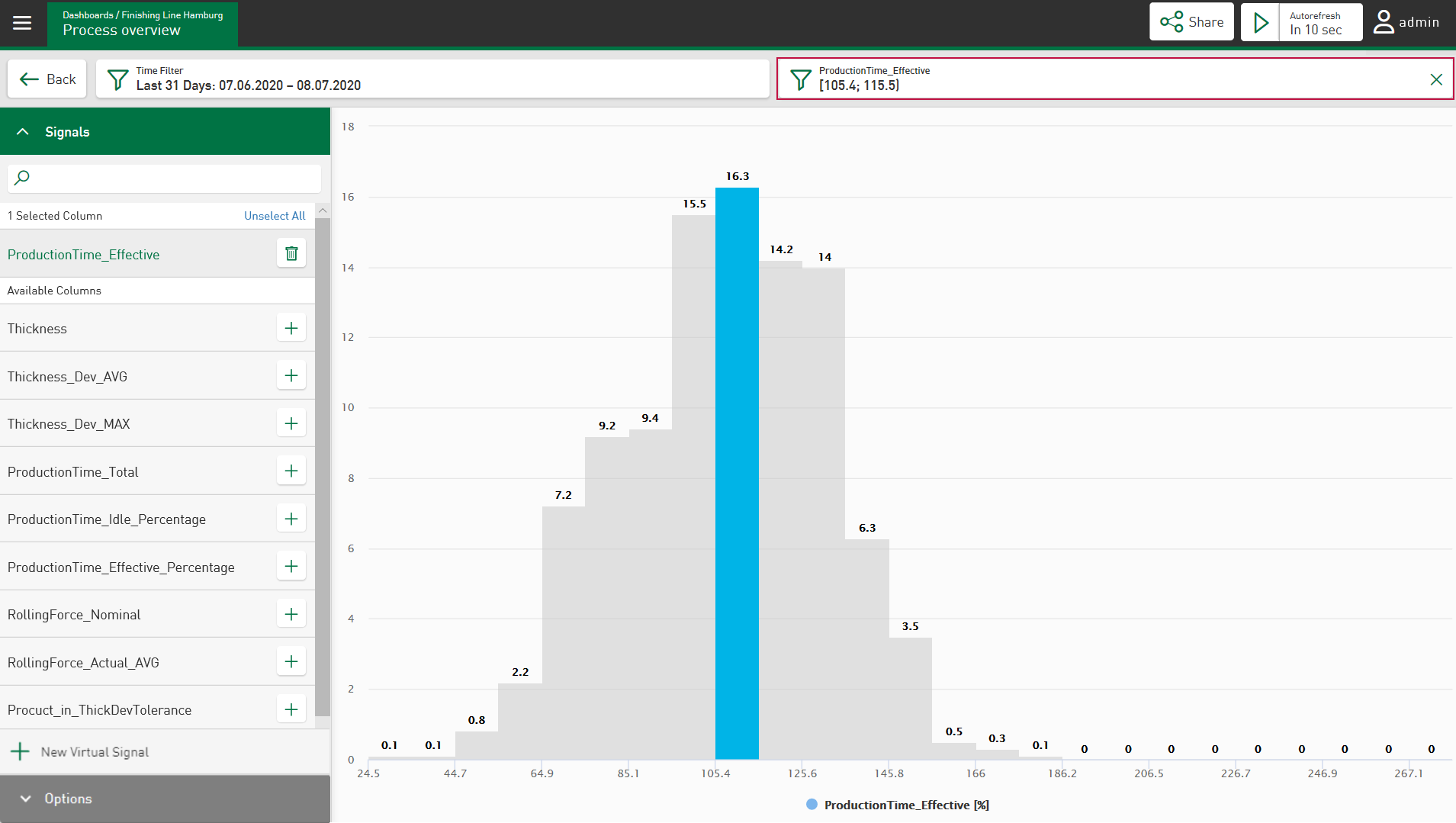
In the Histogram, you can filter according to the underlying classes (bars).
-
To set the filter, tap on one or more bars.
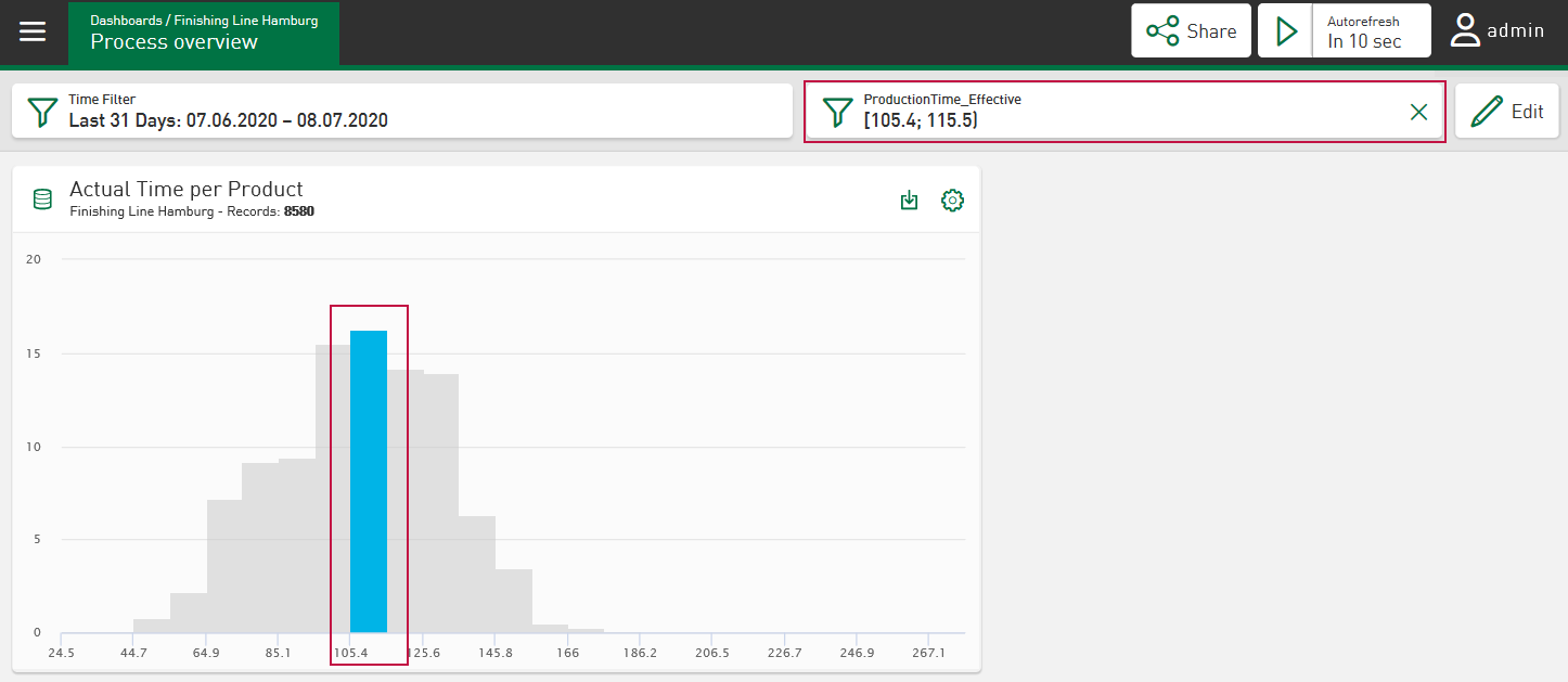
The Histogram then shows the filtered bars in color, the other bars are greyed out. A new field corresponding to the filter selection appears.
Dashboard view:
-
To define the value range more precisely, tap on the filter symbol
 .
.A dialog opens in which you can adjust the From and To values for the value range.

