You can display signal curves and values in different colors based on defined conditions. This allows you to visually highlight limit violations or certain conditions, for example. Conditional color configuration is available for signal curves in line charts, signal points in scatter charts, values in tables, and the value display. Value ranges, another signal or a specific value of a text or digital signal are possible as conditions.
The configuration is described below using the line chart as an example:
-
Open the signal settings in the tile view.
-
Enable the Enable Conditional Colors option.
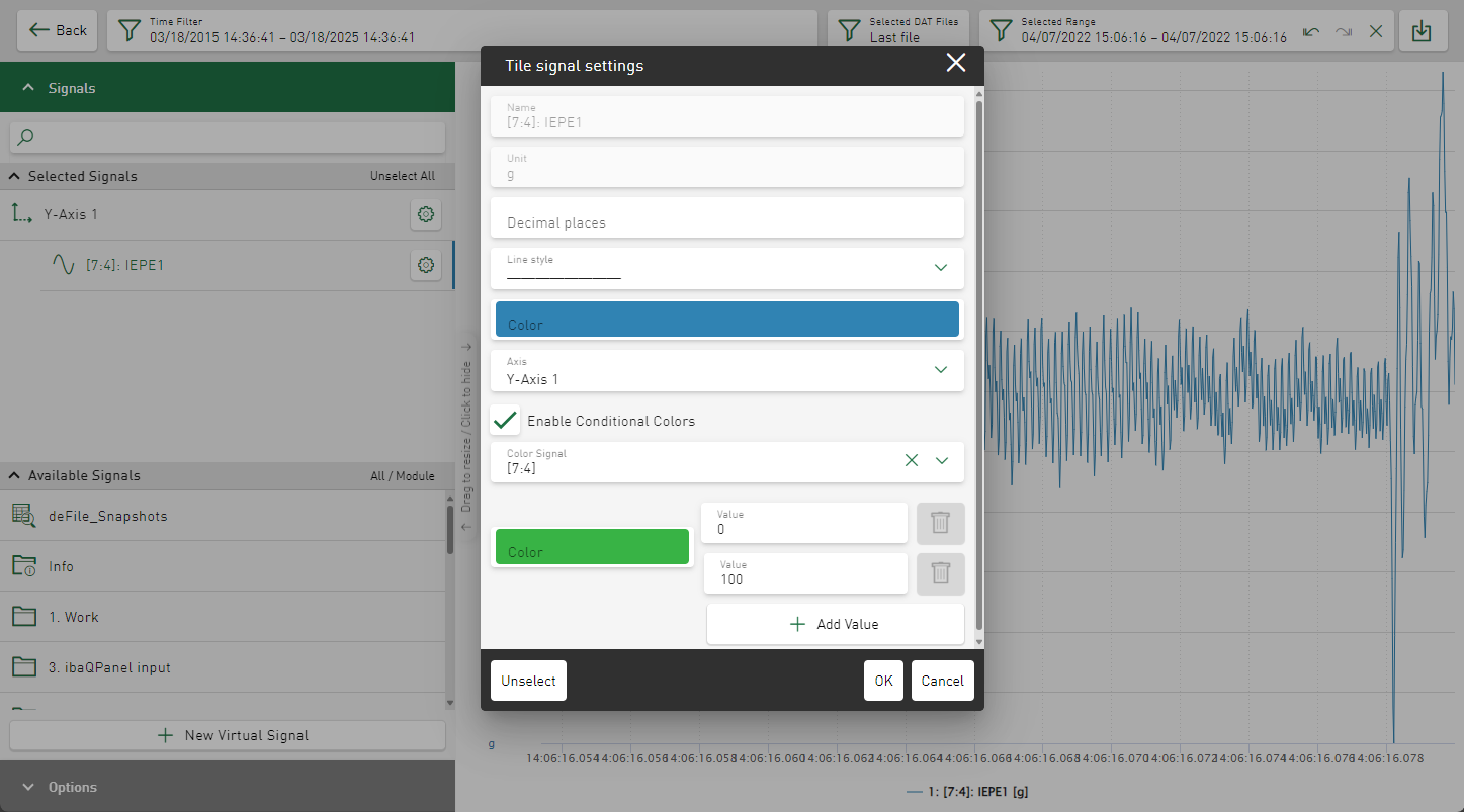
By default, the signal for which you have opened the signal settings is displayed in the Color Signal field.
-
If the conditional coloring is to be determined by a different signal, select this in the Color Signal field.
-
Use the Value fields to enter the lower and upper limits for the first value range.
-
If necessary, change the color for the value range in the color selection field.
-
To add further value ranges, click on the <Add Value> button.
-
Repeat the settings for range limits and color for the new range.
-
Confirm the settings with <OK>.
The signal is displayed according to the settings.
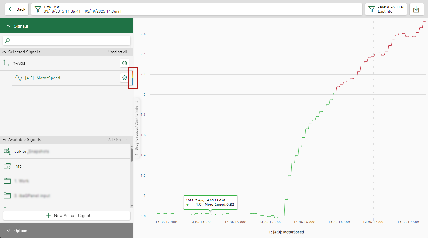
A multi-colored stripe is displayed next to the signal in the signal tree.