In diagrams with axis scaling (e.g.line chart) you can select signals listed in the Available Columns area for display by tapping on the button ![]() . A new axis is created for the selected signal in the Selected Columns area. The signal is assigned to this axis and a new axis is created for each additional
signal selected. Signals that have the same unit are initially combined on a common
axis as standard. However, you can select a different axis at any time via the signal
settings. You can also drag and drop selected signals to a new position in the signal
tree and thus reassign them. The color of the Y-axis always corresponds to the color
of the first signal that you have assigned to the respective axis.
. A new axis is created for the selected signal in the Selected Columns area. The signal is assigned to this axis and a new axis is created for each additional
signal selected. Signals that have the same unit are initially combined on a common
axis as standard. However, you can select a different axis at any time via the signal
settings. You can also drag and drop selected signals to a new position in the signal
tree and thus reassign them. The color of the Y-axis always corresponds to the color
of the first signal that you have assigned to the respective axis.
If you delete an axis, all associated signals are also removed from the range of selected columns and added back to the list of available columns.
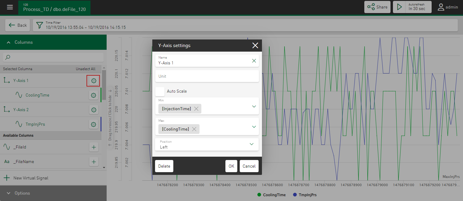
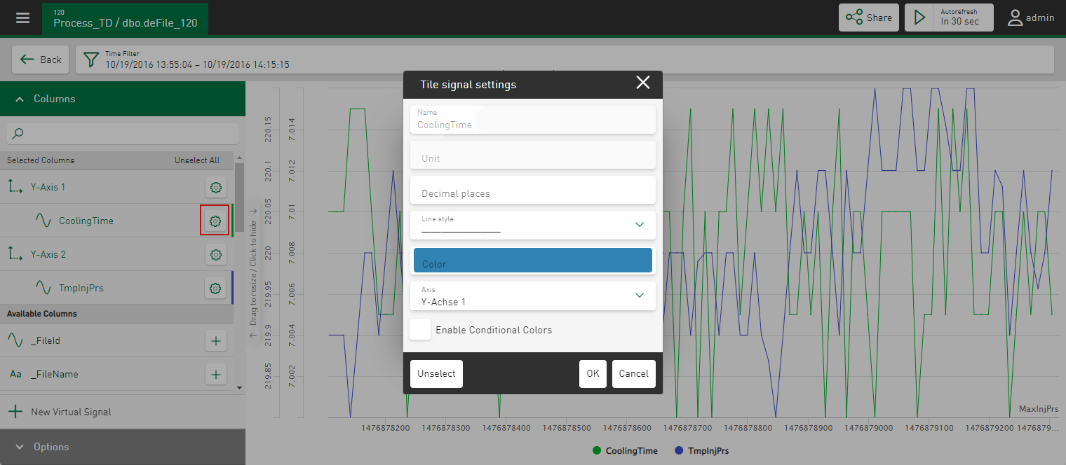
You can define the axis and signal settings via an input dialog. Tapping on the ![]() button in the respective line opens a properties window and the current settings
are shown.
button in the respective line opens a properties window and the current settings
are shown.
Axis settings
In the properties window of the axis settings, you can define the following settings for the display of the axes:
Name
Name of the axis
Unit
Editable unit of the axis
Auto Scale, Min, Max
Specify the type of scaling for the axis. If you enable the Auto Scale option, the axis is automatically selected according to the displayed values. Alternatively, use the Min and Max fields to define fixed minimum and maximum values to determine the value range. The selection list shows the available numerical column values from the iba file table.
To enable dynamic scaling of trends and signals, you can also use other signals as the basis for the y-axis. To do this, select the minimum and maximum signal for scaling in the y-direction. The prerequisite for this is that all columns/signals are assigned to the same axis.
Position
The Y-axis is displayed on the left-hand side by default. Change this option if you want the Y-axis to be displayed on the right-hand side.
Signal settings
You can configure the display of the signals in the properties window of the signal settings.
Name, Unit
Display of the name and the physical unit of the signal (read-only).
Decimal places
Number of decimal places
Line style
Select the style in which the lines of the signal are to be displayed, e.g. dotted or dashed. Lines are solid by default.
Color
Display color for this signal, see also Color selection in tiles.
If no default color is defined in the Datasource Management, a color is automatically assigned to the selected values.
Axis
You can use this option to select a different axis for the signal. A selection list lists all available axes. If necessary, you can also create a new axis here.
Enable Conditional Colors (line charts only)
If you enable this option, you can display the line in freely definable colors depending on conditions.
For information on the configuration of conditional colors, see Configuring conditional colors.

