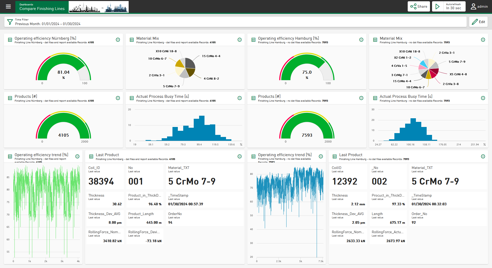
With the Data Visualization and Information Service ibaDaVIS, you can visualize and analyze measurement, process and quality data web-based. ibaDaVIS enables both the long-term analysis of product and process data across measurement files and the root cause analysis by drilling down to high-resolution measurement data.
ibaDaVIS offers a completely new overview and clarity via in-depth insight into data and processes. Systems and machines can be compared with each other based on their characteristic values. The precise information required to monitor systems and machines and to identify weak points and optimization potentials can be quickly and easily displayed.
The production or process can be viewed over long periods of time. Long-term trends, histograms, tables or pie charts are visualization and filter elements in one. Plant operators, process technologists or decision makers see the same data with ibaDaVIS regardless of whether on a PC, mobile tablet or smart phone.
ibaDaVIS uses the latest web technologies and supports all common web browsers such as Google Chrome or Mozilla Firefox. The responsive design enables convenient operation including via tablets or smartphones. Here, only a web browser is needed to connect to ibaDaVIS. Installation of an additional app is not necessary.
Flexible configuration
In the navigation area of ibaDaVIS, the dashboards can be organized hierarchically by location, machine or user groups in order to achieve views of specific assets or production sites or a problem- or user-specific view of the plant or machine. The dashboards can be accessed from anywhere on the web via the structure tree and visualize in tiles the assigned quality or characteristic values from databases or the high-resolution measured values from iba measurement files. With the help of virtual functions, signals or trends can be easily compared and statistical and other values can be calculated. For example, exceeded limit values can be quickly displayed and detected. A wide variety of tile types, such as trend displays, scatter charts, histograms, tables, gauges, pie charts, or bullet graphs are available. The data can be displayed directly or in aggregated form depending on the selected tile. All tiles can be quickly and easily resized and individually positioned by dragging and dropping.
Interactive filter and search functions
ibaDaVIS shows characteristic values or measured values from the same defined time range on all tiles. The time range can be selected directly with date and time or relatively, for example for the last 7 days. All tiles are updated directly after selection and show values from the desired time range. The tiles can also be used as filter objects. For example, by clicking on a segment in the pie chart, the filter is automatically set to the selected group. In this way, a specific material group can be selected, for example. Due to the implicit filter function of ibaDaVIS, all tiles of the dashboard now show the data points or trends that are part of the selected material group.
By zooming in a trend graph, the time range for all displayed characteristic values on the dashboard can be narrowed down very quickly. To track the characteristic values of a specific product, for example, simply enter the product number in the table. The table immediately displays the product-related characteristic values and offers a download of the iba measurement file or the previously created product report.
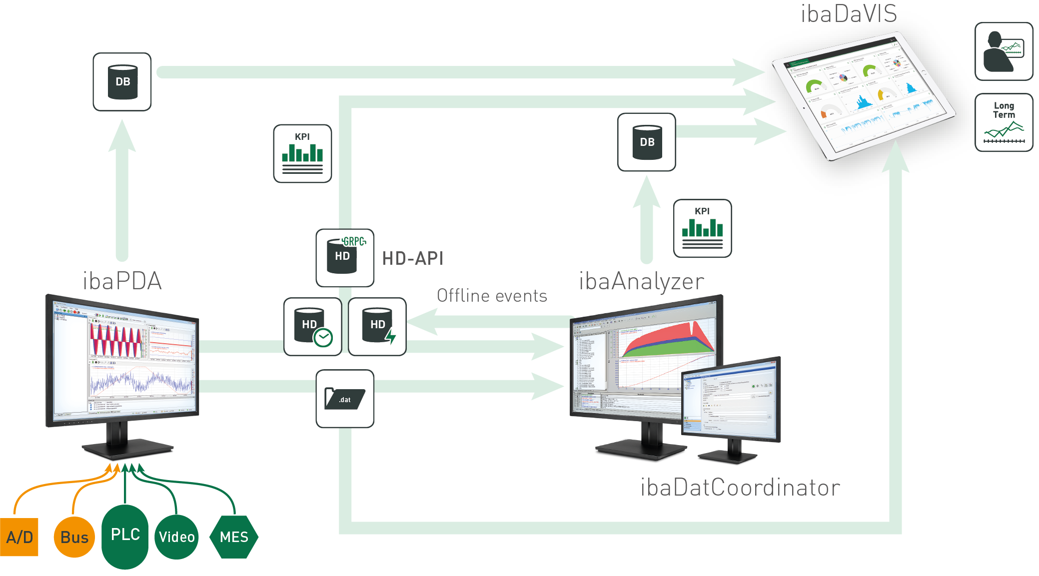
In the following figure the data flow within the iba system is shown.

