The following new functions and improvements are available in ibaDaVIS from version 3.2.
Virtual signals
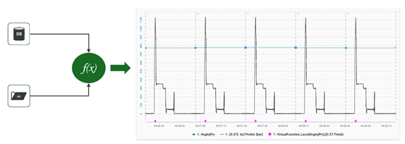
Use data from different data sources
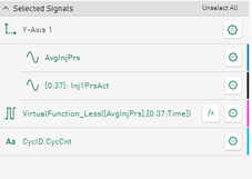
The component for calculating virtual signals is now able to calculate data from different data sources. You can combine signals from DAT files with data from the related index table and display the results in diagrams or use them in other virtual functions.
For more information on the use of virtual signals, see Configuration of virtual signals.
New function MakeVector()
You can now summarize signals from DAT files or columns of a database table into a logical signal group using the MakeVector() function and display them with the Heatmap tile type. In this way, spontaneous anomalies or changes over a longer period of time can be made visible for many signals or values from the database by the resulting color change.
You can find an application example here: Visualization of anomalies with the heat map
Tile configuration – changed structure of the signal tree
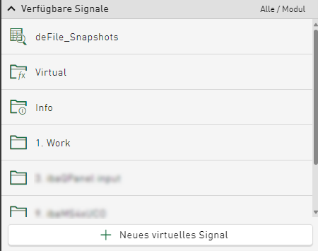
To reduce complexity, the structure of the signal tree has been adapted. Previously, signals from a DAT file and columns of the data from the database tables were displayed in separate signal trees. From version 3.2.0, the column names of the database index table are displayed as selectable signals in a separate, expandable folder:
Configured virtual signals are also added to the same signal tree in a separate folder. The DAT file-specific info fields are added to the signal tree as in other iba tools and displayed as an expandable folder. In the same signal tree, the data file signals are sorted according to modules or logical groups and inserted underneath.
You can select any of the signals mentioned to be displayed in diagrams. Data from any type of data source can be used in all tile types, as long as the value type is supported. In addition, the concept of the table data and the DAT file corresponds to the relationship between the HD time period data and the referenced time-based signal data of the HD store.
HD-data – changes for the display of data from ibaHD-Server
Display of time-based HD data in modules and groups
You can sort signals from time-based HD stores according to different modes in the signal tree:
-
Module-based
-
Sorted linearly by module and signal number
-
Grouped according to the logical groups specified in ibaPDA
The same sorting options are available when displaying signals from DAT files.
Downloading time periods from dashboard table
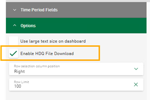
You can now select HD time period stores as a data source for table tiles on dashboards. Based on the data displayed in the table, export as a CSV file is possible. In addition, you can activate the HDQ download for the displayed HD time period data from the table. The option to activate the download of time periods can be found in the table options of the tile.
Note |
|
|---|---|
|
The HDQ file contains the access information to the selected server, time period data using the HD store data, the time stamp, store name and the ID of the time period.
|
|
For additional information, see Downloading time period data as HDQ file.
Display options for time periods in line chart
You can use the line chart to display data from a time-based HD stores. There are special display options that are available if a time-based store is available and refers to the displayed signal data from ibaHD-Server.
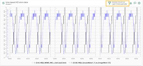
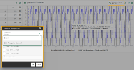
You can use a filter to limit the display to a specific number of the last time periods. Similar to the filter for the DAT files, you can select the last N time periods, see also Filtering time periods.
If several time periods are configured and available, you can select none, only one or several time periods to be monitored in order to automatically receive the last N time periods.
You can display a maximum of the last 50 time periods.
Manual selection of time period data
If you insert a table in a dashboard that displays data from a time period store and a line chart that displays data from the associated time-based HD store, the selection of a row in the table affects the data displayed in the line chart. The line chart only displays the signal data that matches the selected time period in the table.
The behavior corresponds to the selection of rows in a table with data from a file table and a line chart that displays the referenced signal data from data files.
Display modes for time period related signals
By default, the signals of the selected time periods are displayed in Synchronized on recording time mode.
The modes for displaying the signal data in the appended view, the stacked view or the envelope view are now supported for time periods, see Options
Selecting HD time-based data as raw signal data
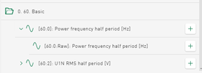
Time-based data is requested as aggregated data for visualization in charts on the dashboard. Depending on the selected tile type, time range and chart size on the screen, the requested data volume and the aggregation level on the ibaHD-Server side differ. For time-based HD signals, the signal tree now provides the raw channel data as sub-nodes.
The requested data volume and display time differ depending on the selected tile type and time range. The raw data of the channel is displayed in the diagram.
New tile type radar chart
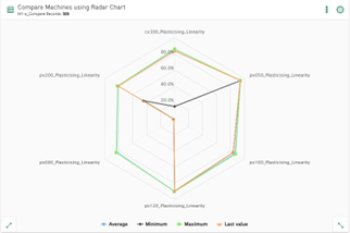
The radar chart, also known as a spider chart, web chart, star chart or funnel chart, is a graphical method for displaying multivariate data in the form of a two-dimensional chart of 3 or more quantitative variables displayed on axes. The axes start from the same point.
You can use the Radar chart tile type to display data from database tables, ibaHD-Servers or DAT files. Use the radar chart, for example, to display statistical data such as maximum, minimum and average values of several selected columns or signals.
Line chart – new display options
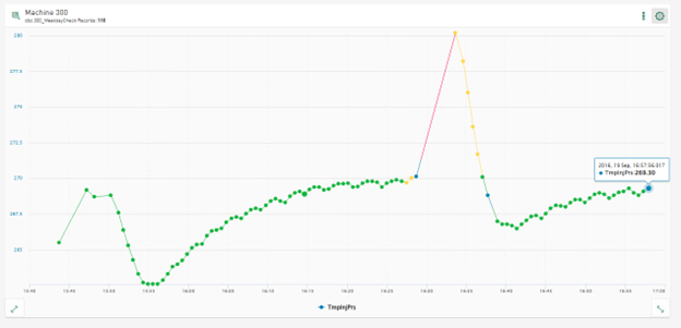
Conditional coloring of signals
Signals can now be displayed in different colors depending on the configured conditions. For example, areas of a signal in which a limit value has been exceeded can be displayed in a different color.
See Configuring conditional colors.
New line style option
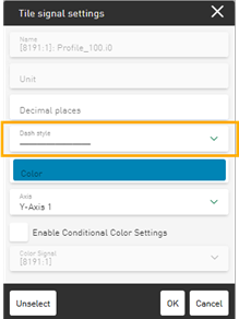
You can now change the line style of selected signals via the signal settings of the tile.
By default, signals are displayed with a solid line. You can use the drop-down field to change the line style to a dashed or dotted line, for example.
Tables – sorting across multiple columns
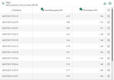
Previously, data in tables could be sorted per column. You can now select multiple columns for sorting. The sorting order is indicated by a small number in the column header together with the sorting direction. To remove a sort filter, tap on Unsorted.
Value display – displaying additional information
Visualization of statistical data
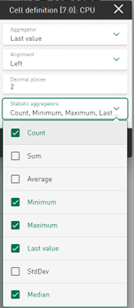
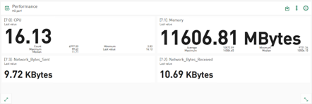
The value display tile shows the last value of the selected signal or column value by default. In addition to this value, further statistical information for numerical values such as maximum, minimum, standard deviation or median can now be displayed in each cell of the value display. The selected additional values are displayed below the main value. The size of the displayed main value is adjusted so that it fits into the value cell.
|
|
|
See also Tile type Value display.
Display data from DAT file info fields
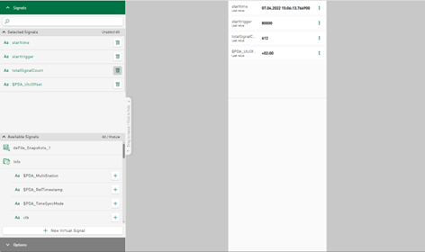
In addition to the signal data, DAT files also contain a number of info fields. The number of info fields and the values vary depending on the application. Nevertheless, the tile for the value display can now also display the info field data from the data files in addition to the signal data. In addition to the signal data, the signal tree also provides the info fields as text channels. You can select the info fields in a similar way to the signal data in order to visualize them in the value display.
The following figure shows the configuration view when adding data from a data source of type DAT file.
The data from the reference data table and the info fields can be added to the value cells, such as statistical values that are calculated online from the signals in the DAT file. The combination of data from file tables, signals displayed in line charts and the visualization of data from info fields on designed value display tiles is possible on dashboards.
Selecting a row in the table affects the information displayed on the tile, just as it affects the line chart that displays data from DAT files.
Bar chart – new display options
Data aggregation over time
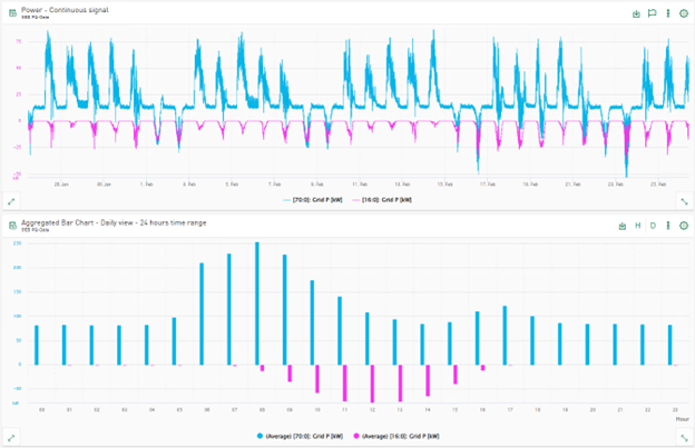
The data displayed in the bar chart can be aggregated over time using different time intervals. The data within the time range can be aggregated and visualized using sub-time ranges, e.g. the hours within a day or the days within a week.
Information on configuration can be found here: Tile type Bar chart
Information in the legend
The bar chart aggregates the selected columns using the average aggregator by default. Instead of the average aggregation over time or the selected category, you can now select other statistical functions for newly added signals or columns in the Options, e.g. maximum value, minimum value or standard deviation. The selected operation is applied to all displayed data if no other aggregation functions are selected per row. In the signal settings dialog, you can select a different aggregation method for each selected signal or column. The aggregator used is displayed as part of the legend for the selected signals or columns.
Scatter chart – connect displayed points in relation to time
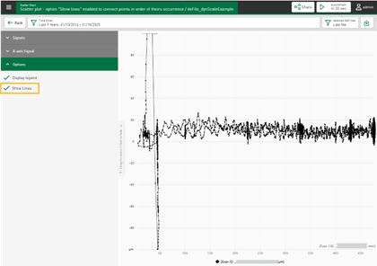
The scatter chart enables the visualization of numerical data. The data can be derived from DAT files, HD tables or event-based/time-based HD stores. The selected signal or column data is displayed by default in chronological order as a scatter chart with time as the X-axis. Each signal or column can be assigned as an X-axis. The scatter chart is changed according to the new settings and the relational scatter chart is displayed.
If you select the option to Display lines, the displayed points are connected to each other in chronological order.
Dark mode for dashboards
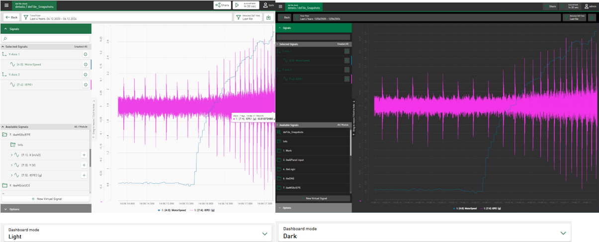
The dashboard visualization tiles can now be displayed in “Dark Mode”. The option to switch between light and dark mode is a user-specific option that you can set for all dashboards in the user profile.
In future versions of ibaDaVIS, the dark mode will be applicable to all parts of the application.
For more information on the setting options in the user profile, see User Profile.
Further improvements for visualization
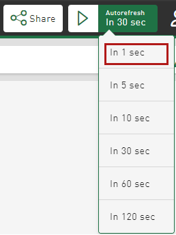
Autorefresh – new interval "1 second"
The interval for refreshing a dashboard automatically can now be set to 1 second, see Refresh dashboard automatically.
Display mode for DAT files and time-based HD data
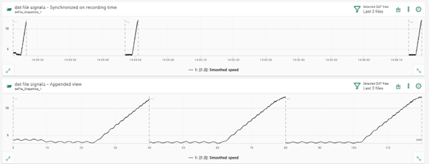
In previous versions, signals from several DAT files were displayed in line charts and heatmaps in appended mode. The signal data is displayed synchronized to the recording time on the time-based X-axis. This mode has been renamed to Synchronized on recorded time. In addition, a new display mode called Appended view has been introduced, which displays signal data from multiple data files that are appended one after the other in chronological order and on the relative time axis.
New display option for Y-axes
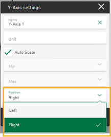
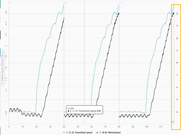
The axis settings of the line chart tile now offer the option of displaying the Y-axis on the right-hand side.
|
|
|
For easier assignment, the color of the Y-axis now corresponds to the color of the first signal assigned to the axis.
Filter options for text columns
In the Table, Pie chart and Bar chart tile types, text columns can be used to display or group the displayed data. You can create filters based on values from text columns by interacting with the table, pie chart or bar chart. Entered filter values are used as dashboard filters.
Filter operators have been implemented to make the filter results more precise: The “Equals” operator provides results that exactly match the entered filter text value, the “Contains” operator provides results that contain the filter value in the text.
System requirements and administration
.NET framework
ibaDaVIS runs with the .NET 8 Framework (8.0.11). The framework is included in the installation package. A separate installation of the framework is not required.
Changes regarding the localization files
In ibaDaVIS, you can convert units from SI to US units via the user profile. The conversion of
the displayed values is based on conversion formulas that are saved in the configuration
file units.json. You can edit this file if further conversion formulas are required. The units.json file is initially stored in the C:\ProgramData\iba\ibaDaVIS\assets directory when ibaDaVIS v3.2.0 is installed.
If you make changes to the units.json file, e.g. add conversions, these are retained during the installation of higher versions of ibaDaVIS and are no longer automatically reset when ibaDaVIS is reinstalled. This behavior is achieved by moving the units.json file from the ~Program Files folder to the ~Program Data folder.
The signal names of signals from DAT files or from the ibaHD-Server can also be localized and translated into different languages. For example, user-defined
signal names are displayed in ibaDaVIS instead of the abbreviations. The signal names are based on the entries in translation
files that are saved in C:\ProgramData\iba\ibaDaVIS\assets\locales. The translation files signals.json are located in the respective localization directories \en, \de, \it, \fr etc., to
name just a few. You can edit these. The signals.json files should contain the identifiers of the measurement signals to be translated
and the respective translated equivalent in order to obtain the translations in the
display. signals.json files that exist as empty files are ignored.
If you make changes to the signals.json file, e.g. add signal names that have not yet been taken into account, these are
retained when installing higher versions of ibaDaVIS and are not automatically reset when reinstalling ibaDaVIS. This behavior is achieved by moving the signals.json files from the ~Program Files folder to the ~Program Data folder.
