How do I create a Pareto chart in ibaDaVIS?
In ibaDaVIS, a Pareto chart corresponds to a bar chart in which the bars are sorted by size.
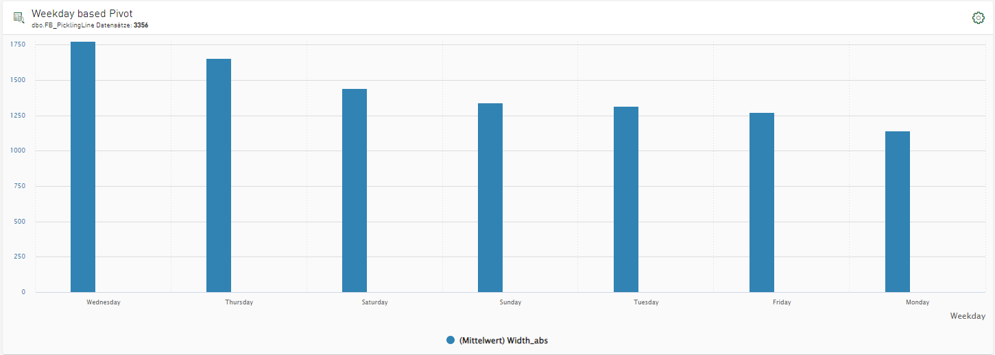
Example:
-
Create a tile of the Bar chart type and select the desired data source, see Tile type Bar chart.
-
Under Signal or Column, select the signal or column to be displayed in the diagram.
-
Select the Category according to which the data is to be grouped.
-
Select "Max. Value" in the Sorted by field.