When you open a trend analysis, there is always one Y-axis on the left side of the graph.
Basically, the trend analysis has two types of Y-axes:
-
Y-axis in relative view, values given in percentage (%)
-
Y-axis in absolute view, values given in signal units
All signals you drag & drop from the plant tree into the trend graph are listed in the trend legend on the right side below the first Y-axis.
Trend legend
The trend legend provides information and functions for each signal in the trend graph.

Beside the color code and the signal name there are still the limits, provided the limits are defined.
Optionally, if you open the three-dot menu in the toolbar of the trend view, you can show or hide metadata of the signal (1) and the plant path (2) of the corresponding component.
A little toolbar provides different functions referring to the signal. Check the tooltips to understand the functions.
Edit Y-axis
You can rename a Y-axis and configure a manual scale.
Click on the pen symbol in the trend legend to edit the Y-axis.

Name
Enter a meaningful name for the Y-axis in the Name field.
Manual scale:
The manual scale is disabled by default. If you want to set up a manual scale then enable the option Manual scale and enter the lower scale value in the Min field and the upper scale value in the Max field (given in signal units).
If a Y-axis has a manual scale, the value range is indicated in the trend legend.

Multiple Y-axes
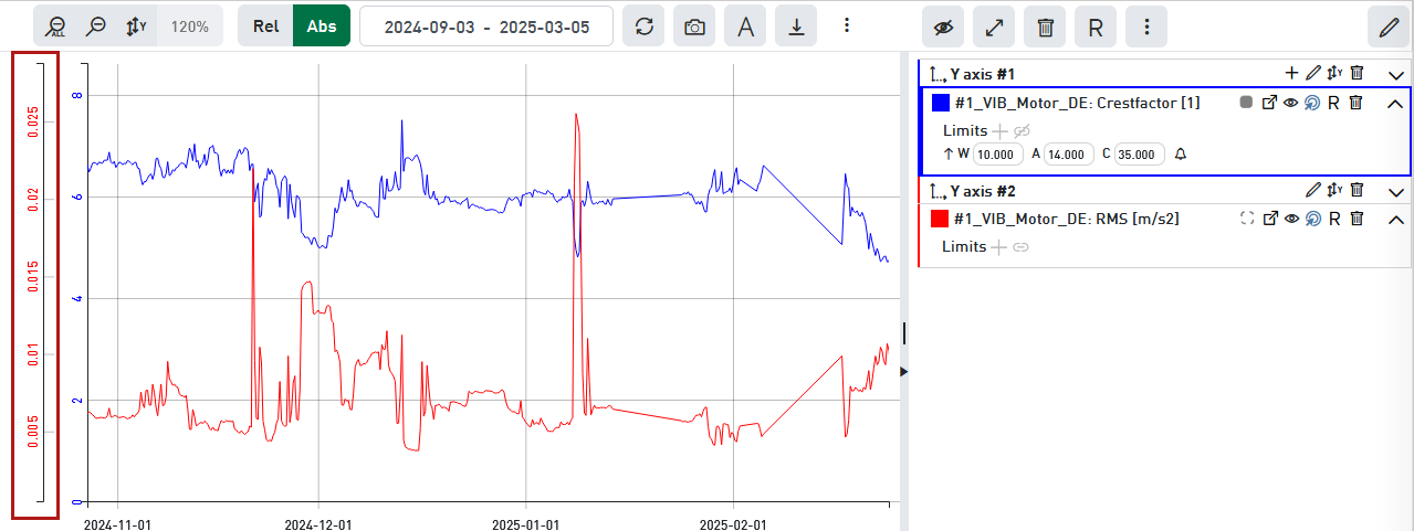
If you want to display signals of different units or significantly different value levels together in one graph you may get problems.
The following figure shows two different signals with different units and value ranges which do not fit together.

The value level of the red trend is extremely lower than the blue one and hence not useful.
Therefore, it is possible to define multiple Y-axes in the absolute view, in order to provide for each signal a scale that fits for an optimal representation.
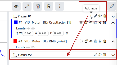
You add another Y-axis as follows
-
Click on the plus symbol in the trend legend of the topmost Y-axis.
-
Below the last signal there appears a new line for a second Y-axis (#2).
-
Now drag & drop a signal from the Y-axis #1 below the line of Y-axis #2. Of course, you can also drag other signals from the plant tree into the trend graph. All further signals will be automatically assigned to the lower Y-axis (here #2).
-
Then adjust the scaling of the new Y-axis either by turning the mouse wheel on the Y-scale or by executing autoscale in the trend legend of the Y-axis.


Add signals
If you add signals out of the plant tree to the trend graph the signals will always be assigned to the lowest Y-axis.
If you want to assign a signal to one of the upper Y-axes, move it in the trend legend to the desired Y-axis after the addition.
Y-axes in signal legend
If you have assigned multiple signals to different Y-axes, the signal legend will indicate this fact.
The grouping of signals is indicated in front of the signal names by a connecting line.

The line has the same color like the first signal on the corresponding Y-axis. The order of the signals corresponds to the order in the trend legend.