If you open a signal analysis from within a trend analysis, only the selected signal will be analyzed in that window.
However, it may be useful to compare other signals from the same measurement file or the same time period, such as the signal from another sensor.
If you want to add more signals to the analysis, select the Signals tab on the left side, in the kinematics table area.
Signals tab
This tab lists all the signals contained in the measurement file on which the trend analysis is based. The main signal for which the signal analysis was opened is highlighted in bold.
On the left side of the tab's toolbar is a field that displays the marker position M1 in the trend view. This marker position indicates the point in time from which the measurement file whose data is currently being displayed originates.
If you load the previous or next measurement file from the analysis tile's toolbar, the position of the M1 marker will also change. The same applies when you move the M1 marker in the trend view. A change in the marker's position immediately causes the new data to be loaded and the trend graphs to be updated.
Using the other two buttons on the toolbar, you can display the signals in the tab in two different ways:
|
Signals grouped by module 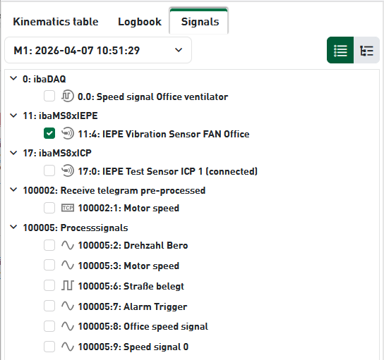 |
Signals grouped by aggregates 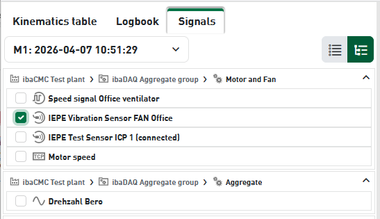 |
To add more signals for analysis, you have two options:
-
Select a signal by checking the box in the signal list.If you check the box next to the desired signal, a chart for that signal—with its own axis and marker settings based on the selected analysis types—will be added below the main signal.
-
Drag and drop a signal into the existing chart.You can use drag and drop with the mouse to drag a signal from the signal list into the chart of an already open signal. A tooltip that appears when you move the signal indicates when you can drop it. The color of the curve is adjusted automatically. The curve is overlaid on the Y-axis of the existing graph and scaled accordingly.This method is useful when you want to compare or superimpose similar signals that have the same physical unit and a similar signal level.
The following figure shows an example with two sensor signals, selected by checking the boxes in the signal list.

The following figure shows the example using the same signals with the drag-and-drop method. For better visualization, the image has been heavily zoomed in along the X-axis.
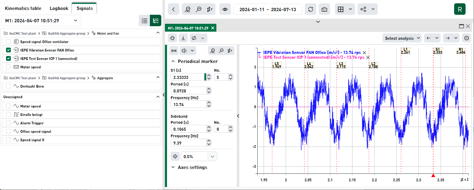
If you have selected multiple analysis types, such as time signal and FFT spectrum, a graph will be created for each analysis type when you add another signal. The charts are organized by analysis type. This means that the time-signal trends are listed one below the other first, followed by the FFT spectra, and so on. This ensures that similar trends are grouped together, making it easier to compare them.
When you add a signal to a chart using drag-and-drop, its curves are automatically plotted in the other analysis types.
Removing Signals
To remove any signals you've selected, simply uncheck the box in the signal list. Alternatively, you can also click the "X" in the trend legend to remove a signal.