
The settings in the "Preferences" dialog basically equal the ones in the "Properties" dialog, except for the "Advanced" node, which is not available in the "Properties".
The "Signals" branch in the preferences tree corresponds to the "X graph" branch in the properties tree. The settings for the Y-axis are available separately in the Properties of a trend display for each curve (Y-axis x).
Miscellaneous
Enable smooth drawing
The curves will be graphically smoothened if this option is selected.
Show toolbar
This option determines whether or not the toolbar for display control of each view is displayed below the tab.
Show signal bars
By checking this option, a bar graph is displayed near the Y axis. Each signal is displayed by a bar in the corresponding color.
Show gridlines
By enabling/disabling this option, you can show or hide the grid lines in the display. Enabled by default.
Show close button
By enabling/disabling this option, you can show or hide the small buttons for closing all signal charts of a display.
Hiding the button provides some more space on the screen and prevents the unintended closing of a signal chart. Enabled by default.
Show Y-axes
By enabling/disabling this option, you can show or hide the Y axes of all signal charts of a display. Enabled by default.
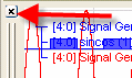
Show signal visibility icons
If you enable this option then a small eye symbol is displayed in the signal legend. By clicking on this symbol you can temporarily hide a signal curve without removing it from the trend display. Clicking again makes the curve visible once more.
Disable Y-axis zoom
If you enable this option then all the actions for zooming into the display are only applied in the X direction; the Y direction remains unaffected.
Always show X-axis
If you select this option then it is ensured that the x-axis is always displayed under the lowest fully-visible signal chart. If this option is not enabled, the x-axis can scroll downwards out of sight when scrolling within the display (if you have created many signal charts).
Orientation
The orientation of the "paper feed" in the signal display can be selected from this pick-list.
Restart scrolling after … s of inactivity
Enter a value in seconds between 10 and 6000. In case the pause button was pressed in a monitor to stop scrolling of the charts scrolling will restart after the given time if no operation (incl. mouse movement) has been made since pressing the pause button.
Update interval
Enter a value given in milliseconds between 50 and 10000 for the refresh rate of the trend graph display. A fair fluent movement can be achieved with 100 ms and below.
Anchor markers on X-axis
If you enable this option then the markers stay at the x-axis position where they were placed with the mouse even if you then zoom into the curve or scroll along the x-axis. The markers can therefore disappear from sight. If you do not select this option, the markers always remain visible in the curves window, even if you zoom or scroll. However, they do leave their configured x-axis position.
The markers are only visible in pause mode.
Align digital signals with legend
Normally, the digital signals are displayed on the bottom of a signal chart. By enabling this option, you can assign the digital signals with the top of the signal chart.
Allow text signal overlap
When displaying text channels in an ibaQPanel trend curve, it can happen that, depending on the feed rate and change frequency of text channels, the texts are written one above the other so that they are no longer readable or even overwrite the curves. This cannot always be prevented in the online mode of the display. This option is available for the pause mode.
If you enable this option then overlapping text channel displays also appear overlapped in pause mode. If you disable this option then the texts appear cleanly separated as long as there is enough space.
Center time axis on last known value
If this option is enabled and you switch to a different layout during the measuring, the position of the time-axis is saved with the last value captured. If you then later retrieve or load the layout then the trend display in pause mode stays exactly the same as when you left the layout.
If this option is not enabled, the trend display continues to run after a layout change and does not go into pause mode.
Show color axes
By enabling/disabling this option you can show/hide the color axes in a 2D-vector representation.
Colors
This dialog can be used to adjust the colors used for the user interface of the program and for the curves. In order to change the colors, click on the colored buttons and select a color from the palette.
Background color:
Color of the area around the graphs, within the view.
Axis color:
Color of the scales, for the X axis also color of the labeling (values).
Gridlines color:
Color of the grid in the graphs.
Graph color:
Background color inside the graphs. Default is monochrome. You can even define a color gradient or shaded background. In order to configure a gradient, double-click on the little squares at the end of the thin color bar in the dialog and select the two colors. If required, double-click on the color bar to add more color tags and color them; they can also be moved. If you want to remove a color tag, simply click on it to select it (black arrow) and press the <DEL> button.
Signal colors:
These are the 16 pen colors for the curves. These colors represent the order (top-down) used by the automatic signal color map function. You will find the same colors in a graph's "Properties" dialog, "Signal" tab, for coloring the signals.
Fonts
For labeling the axes and legend, you can select different fonts here. To change a
font, click on the browser button ![]() in the corresponding input field and choose a font.
in the corresponding input field and choose a font.